Every year brings a new design mood, and 2026 is painting it softer, calmer, and more intentional.
The world of interiors is embracing a fresh wave of shades that reflect who we’ve become: mindful, expressive, and comfort-driven. Whether it’s bold accents or soothing neutrals, this year’s palettes are about balance between calm and creativity.
Paint and décor brands are already unveiling their “Colours of the Year,” setting the tone for modern apartments that feel both fresh and timeless. Let’s explore what’s trending and how you can bring these shades into your own space.
The Colour Forecast for 2026
While Pantone hasn’t officially announced its Colour of the Year, market experts predict that soothing yet expressive shades like sage green, smoky jade, or muted lavender will be popular. These colours strike the right balance: calm enough to relax in, but with enough personality to make a statement.
Indian paint brands are following the same direction.
Asian Paints’ ColourNext 2026 is highlighting earthy, grounding tones to help urban apartments feel bigger and more serene.
Berger is focusing on warm neutrals like honey beige and clay-inspired shades, perfect for cosy, modern homes.
Nerolac embraces muted greens and soft pastels, giving homeowners versatile options to refresh smaller spaces without overwhelming them.
Sustainability is another key focus. Low-VOC paints and eco-friendly pigments are trending, helping homeowners update interiors in a way that’s both stylish and environmentally conscious.
How to Use the Trending Colours in Your Apartment
Once you know the palette, the next step is putting it to use in your spaces. Here’s how 2026’s trending shades can transform each space:
Living Room: Paint one accent wall in a trending shade to make the room feel inviting. For example, a smoky jade wall paired with a cream sofa adds calmness while keeping it stylish. Neutral furniture keeps the balance, so the colour pops without overwhelming the space.
Bedroom: Bedrooms are all about rest. A clay pink accent wall behind the bed instantly creates a cosy, relaxing vibe. Add matching cushions or curtains in muted tones like sage green or soft lavender for a coordinated, serene feel.
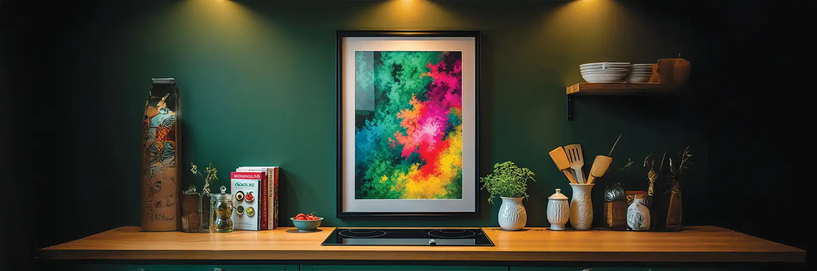
Kitchen & Dining: Warm, earthy tones like terracotta or honey beige work beautifully in small kitchens and dining areas. Use them on a backsplash, open shelves, or decorative pieces. They add warmth and make compact spaces feel inviting and lived-in.
Bathroom: Matte pastel tiles or soft shades can give any bathroom a spa-like vibe. For instance, a wall with matte pastel blue tiles can make the space feel fresh and airy, while neutral accessories keep it modern.
Balcony or Nooks: You don’t need to paint walls to add colour. A sage green planter or a mustard-coloured cushion instantly brightens up a corner, making it feel cheerful without any big makeover.
Pro tip: Always test a small patch before committing. Light, room size, and furniture placement can change how a colour looks in your space.
Mixing and Matching Like a Pro
Once you’ve found the right colours, the magic lies in how you bring them together. Here’s how to create a balanced, beautiful mix:
Pair with neutrals: Colours like ivory, beige, or muted grey act as a calming backdrop, letting accent shades like smoky jade or clay pink stand out without overwhelming the room.
Add metallic accents: Brass, rose gold, or matte black fixtures and décor pieces can add subtle contrast and depth. For example, a brass lamp against a sage green wall makes the colour pop elegantly.
Layer tones with décor items: Instead of painting every wall, use cushions, rugs, curtains, and wall art to bring your palette to life. A terracotta cushion on a neutral sofa or pastel-hued artwork in the bedroom creates visual interest instantly.
Test in different lights: Colours look different under sunlight and artificial lighting, so always check your choices before committing.
Pro tip: Stick to 2-3 main colours per room and use smaller accessories to vary the palette. This creates a cohesive, lived-in look without clutter.
Trending ideas for home type
Colour has the power to change how we feel in a space; it can calm, energise, or inspire.
Designers and brands alike agree that 2026 is about personal expression meeting practicality. While 2024 and 2025 saw bolder experimentations, 2026 brings balance, with colours that make homes feel alive and easy to live in.
According to Asian Paints ColourNext 2026 and Dulux trend reports, homeowners are moving towards adaptable palettes that work across different home types and lifestyles. Designers on social media echo the same: the best interiors are no longer about perfection, but about personality.
Trending Ideas for Different Home Types
Urban apartments: Light, airy shades like sage green, clay pink, and dusty beige are helping small homes feel more open. Many homeowners are pairing these with floating wooden shelves, cane furniture, and warm lighting for a soft, organic finish.
Villas and larger homes: Deep emeralds, terracotta, and charcoal tones are being used to define zones, a dining wall here, a reading corner there. Mixed textures like linen drapes, brass fixtures, and rough stone finishes keep the space grounded yet luxe.
Rental-friendly interiors: The focus is shifting to removable design, peel-and-stick wallpaper, bold rugs, and coloured planters. These allow renters to follow trends without making permanent changes.
Sustainability also continues to guide 2026’s design direction. Low-VOC and eco-friendly paints are now widely available, helping you refresh your interiors responsibly. The bigger message? Choose colours that feel good, live well, and last long, because the best homes are the ones that grow with you.
Conclusion
Colours are more than decoration; they set the mood, comfort, and personality of your home. 2026’s palette makes it easy to refresh your apartment without major renovations. Use these trending shades thoughtfully, and your home will feel modern, cosy, and reflective of your personality, exactly the way a home should feel.
FAQs
What colours should I avoid if I want my home to feel calm and spacious?
Avoid very dark or overly bright colours like deep reds, jet black, or neon tones in small spaces. They can make rooms feel smaller and heavier. Instead, stick to mid-toned or pastel versions of these shades for a softer, open look.
How can I make my home look stylish year-round if trends keep changing?
Choose timeless base colours like ivory, taupe, or warm beige and bring trends in through smaller, replaceable elements such as cushions, planters, or wall prints. This keeps your space flexible and on-trend without frequent repaints.
Do colour trends really impact your mood or productivity?
Absolutely. Studies show colours influence how we feel, soft greens and blues promote calm, yellows and terracotta add energy, while lavender and beige encourage focus. Choosing the right tones can make your home feel more balanced and inspiring every day.
Sources
Forbes | Berger Paints | LinkedIn
பொருளடக்கம்
அறிமுகம்
2026-க்கான நிற முன்னறிவிப்பு
உங்கள் அபார்ட்மெண்டில் டிரெண்டிங் நிறங்களைப் பயன்படுத்துதல்
மிக்ஸிங் மற்றும் மேட்சிங்கில் நிபுணரைப் போல மாற்றுங்கள்
வீட்டு வகைக்கான டிரெண்டிங் ஐடியாக்கள்\
முடிவு
அடிக்கடி கேட்கப்படும் கேள்விகள்
2026 வீடுகளுக்கான நிற போக்குகள்: மென்மையான, நிலையான, மற்றும் எளிதான ஸ்டைலான (H1)
ஒவ்வொரு ஆண்டும் புதிய வடிவமைப்பு மனநிலையை கொண்டு வருகிறது, மேலும் 2026 அதை மென்மையாகவும், அமைதியாகவும், மேலும் நோக்கத்துடனும் வரைகிறது.
உட்புற உலகம் நாம் ஆனவர்களை பிரதிபலிக்கும் புதிய நிற அலைகளை ஏற்றுக்கொள்கிறது: கவனமுள்ள, வெளிப்படையான, மற்றும் ஆறுதல்-உந்துதல். தைரியமான அக்சென்ட்கள் அல்லது அமைதியூட்டும் நியூட்ரல்கள் எதுவாக இருந்தாலும், இந்த ஆண்டின் பேலட்டுகள் அமைதி மற்றும் படைப்பாற்றல் இடையே சமநிலையைப் பற்றியது.
பெயிண்ட் மற்றும் டெகோர் பிராண்டுகள் ஏற்கனவே தங்கள் “ஆண்டின் நிறங்களை” அறிமுகப்படுத்துகின்றன, நவீன அபார்ட்மெண்டுகளுக்கு புதியதாகவும் காலமற்றதாகவும் உணரும் தொனியை அமைக்கின்றன. டிரெண்டில் என்ன இருக்கிறது மற்றும் உங்கள் சொந்த இடத்தில் இந்த நிறங்களை எப்படி கொண்டு வரலாம் என்பதை ஆராய்வோம்.
2026-க்கான நிற முன்னறிவிப்பு
பாண்டோன் அதிகாரப்பூர்வமாக அதன் ஆண்டின் நிறத்தை அறிவிக்கவில்லை என்றாலும், சந்தை நிபுணர்கள் அமைதியூட்டும் ஆனால் வெளிப்படையான நிறங்கள் போன்ற சேஜ் பச்சை, ஸ்மோக்கி ஜேட் அல்லது மியூட்டட் லாவெண்டர் பிரபலமாக இருக்கும் என்று கணிக்கின்றனர். இந்த நிறங்கள் சரியான சமநிலையை ஏற்படுத்துகின்றன: ஓய்வெடுக்க போதுமான அமைதி, ஆனால் அறிக்கை செய்ய போதுமான ஆளுமை.
இந்திய பெயிண்ட் பிராண்டுகள் அதே திசையைப் பின்பற்றுகின்றன.
ஏசியன் பெயிண்ட்ஸின்(Asian Paints) கலர்நெக்ஸ்ட் 2026 பூமி சார்ந்த, அடித்தளமான தொனிகளை முன்னிலைப்படுத்துகிறது, நகர்ப்புற அபார்ட்மெண்டுகளை பெரிதாகவும் மேலும் அமைதியாகவும் உணர உதவுகிறது.
பெர்ஜர் நிறுவனம் தற்போது ஹனி பேஜ் மற்றும் களிமண் கலரால் (clay) மென்மையான நிறங்கள் போன்ற (warm neutral) shades மீது கவனம் செலுத்துகிறது. இவை சுகமான, நவீன வீட்டுக் கட்டமைப்புகளுக்கு சிறப்பாகப் பொருந்தும்.
நெரோலாக்(Nerolac) மியூட்டட் பச்சை மற்றும் மென்மையான பாஸ்டல்களை ஏற்றுக்கொள்கிறது, சிறிய இடங்களை மிகையாக்காமல் புத்துணர்ச்சியூட்ட வீட்டு உரிமையாளர்களுக்கு பல்திறன் விருப்பங்களை வழங்குகிறது.
நிலைத்தன்மை மற்றொரு முக்கிய கவனம். குறைந்த-VOC பெயிண்ட்கள் மற்றும் சுற்றுச்சூழல் நட்பு பிக்மெண்டுகள் டிரெண்டிங், வீட்டு உரிமையாளர்களுக்கு ஸ்டைலான மற்றும் சுற்றுச்சூழல் உணர்வுள்ள வகையில் உட்புறங்களை புதுப்பிக்க உதவுகிறது.
உங்கள் அபார்ட்மென்டில் டிரெண்டாகும் நிறங்களைப் பயன்படுத்துவது எப்படி
நீங்கள் எந்த நிறத் தொகுப்பை (palette) தேர்ந்தெடுக்கிறீர்களோ, அதைப் பயன்படுத்தி இடங்களை அழகாக வடிவமைப்பதே அடுத்த படி. 2026-இல் டிரெண்டாகும் நிறங்கள் உங்கள் வீட்டின் ஒவ்வொரு பகுதியையும் எவ்வாறு மாற்றிவிட முடியும் என்பதைப் பார்ப்போம்:
லிவிங் அறை (Living Room):
ஒரு சுவற்றை டிரெண்டாகும் நிறத்தில் (accent wall) பூசினால், அறை வரவேற்கும் உணர்வை அளிக்கும். எடுத்துக்காட்டாக, smoky jade நிறச் சுவர் மற்றும் cream sofa இணைந்தால் அமைதியான மற்றும் ஸ்டைலிஷ் தோற்றத்தைத் தரும். நியூட்ரல் (neutral) நிற மென்பொருட்கள் (furniture) இடத்தை சமநிலைப்படுத்தும், அதனால் நிறம் அழகாகத் தெரியும் ஆனால் அதிகப்படியாகப் பட்டுவிடாது.
படுக்கையறை (Bedroom):
படுக்கையறை ஓய்வுக்கான இடம் என்பதால், clay pink நிறத்தில் படுக்கையின் பின்னால் ஒரு சுவர் பூசுவது உடனே சூடான மற்றும் அமைதியான உணர்வைத் தரும். அதோடு sage green அல்லது soft lavender போன்ற மெல்லிய நிறங்களில் திரைகள் அல்லது குஷன்களைச் சேர்த்தால் ஒரே நிறத் தன்மை கொண்ட அமைதியான தோற்றம் கிடைக்கும்.
சமையலறை மற்றும் உணவறை (Kitchen & Dining):
Terracotta அல்லது honey beige போன்ற சூடான மண்ணின் நிறங்கள் சிறிய சமையலறைகள் மற்றும் உணவறைகளில் சிறப்பாகப் பொருந்தும். இவற்றை backsplash, open shelves, அல்லது அலங்காரப் பொருட்களில் பயன்படுத்தலாம். இவை இடத்துக்கு சுவடு (warmth) சேர்த்து, சிறிய இடங்களையும் உயிரோட்டமுள்ளவையாக உணரச் செய்கின்றன.
குளியலறை (Bathroom):
Matte pastel டைல்கள் அல்லது மென்மையான நிறங்கள் எந்தக் குளியலறையையும் spa-like உணர்வுடன் மாற்றி விடும். எடுத்துக்காட்டாக, matte pastel blue டைல் சுவர் ஒரு புதிய, காற்றோட்டமான தோற்றத்தை அளிக்கும். அதோடு நியூட்ரல் ஆக்சசரிகள் சேர்த்தால், குளியலறை நவீனமாகவும் சுத்தமாகவும் இருக்கும்.
பால்கனி அல்லது சிறு மூலைகள் (Balcony or Nooks):
சுவர் பூசாமல் கூட நிறத்தைச் சேர்க்க முடியும். ஒரு sage green planter அல்லது mustard colour குஷன் போன்றவை ஒரு மூலையை உடனே பிரகாசமாக்கி, பெரிய மாற்றம் இல்லாமலேயே மகிழ்ச்சியான தோற்றத்தை உருவாக்கும்.
ப்ரோ டிப் (Pro Tip):
முழு சுவரை பூசுவதற்கு முன் எப்போதும் ஒரு சிறிய பகுதியைச் சோதித்து பாருங்கள். ஒளி, அறையின் அளவு, மற்றும் மென்பொருட்களின் அமைப்பு இவை அனைத்தும் அந்த நிறம் உங்கள் இடத்தில் எப்படி தோன்றும் என்பதை மாற்றக்கூடும்.
நிபுணர் போல நிறங்களை கலப்பது மற்றும் பொருத்துவது எப்படி
சரியான நிறங்களைத் தேர்ந்தெடுத்த பிறகு, உண்மையான மாயம் அவற்றை எப்படிச் சேர்க்கிறீர்கள் என்பதில்தான் இருக்கிறது. உங்கள் வீட்டை அழகாகவும் சமநிலையுடனும் வைத்திருக்க சில வழிகள்:
நியூட்ரல் நிறங்களுடன் சேர்க்கவும்: ivory, beige, or muted grey போன்ற நிறங்கள் அமைதியான பின்னணியாகச் செயல்படுகின்றன. இதனால் smoky jade அல்லது clay pink stand போன்ற நிறங்கள் அறையை மிகைப்படுத்தாமல் வெளிப்படையாக மிளிரும்.
உலோக ஒளிர்வுகளைச் சேர்க்கவும்: Brass, rose gold, or matte black போன்ற உலோக அம்சங்கள் சிறிய ஆனால் அழகான மாறுபாட்டைத் தருகின்றன. எடுத்துக்காட்டாக, sage green சுவரின் முன் brass lamp வைப்பது, நிறத்தை அழகாக வெளிப்படுத்தும்.
அலங்காரப் பொருட்களால் நிற அடுக்குகளை உருவாக்கவும்: ஒவ்வொரு சுவரையும் பூசுவதற்குப் பதிலாக, cushions, rugs, curtain, மற்றும் wall art போன்றவற்றை உபயோகித்து உங்கள் நிறத் தொகுப்பை உயிரோட்டமுள்ளதாக ஆக்கலாம். எடுத்துக்காட்டாக, நியூட்ரல் சோஃபாவில் terracotta cushion வைப்பது அல்லது படுக்கையறையில் pastel artwork வைப்பது உடனடியாக கண்ணுக்கு சுவாரசியத்தைத் தரும்.
பல்வேறு ஒளிகளில் சோதனை செய்யவும்: நிறங்கள் இயற்கை வெளிச்சத்திலும் செயற்கை விளக்கிலும் வேறுபடக் கூடும். ஆகவே முழு சுவர் பூசுவதற்கு முன் அவற்றை இருவிதமான ஒளியிலும் பார்த்து உறுதிப்படுத்துங்கள்.
ப்ரோ டிப் (Pro Tip): ஒவ்வொரு அறைக்கும் 2 அல்லது 3 முக்கிய நிறங்களையே வைத்துக்கொள்ளுங்கள். சிறிய அலங்காரப் பொருட்களைக் கொண்டு சிறிய மாறுபாடுகளைச் சேர்த்தால், இடம் ஒற்றுமையுடனும் இயல்பான அழகுடனும் இருக்கும் குழப்பமின்றி.
வீட்டு வகைகளுக்கு ஏற்ப டிரெண்டாகும் நிற ஐடியாக்கள்
நிறங்கள் நம் மனநிலையையும் உணர்வையும் மாற்றும் ஆற்றல் உடையவை அவை நம்மை அமைதியாகவும் உற்சாகமாகவும் அல்லது சிந்தனையூட்டுவதாகவும் ஆக்கலாம்.
2026-இல் வடிவமைப்பாளர்கள் மற்றும் பிராண்டுகள் கூறுவது ஒன்றே தனிப்பட்ட வெளிப்பாட்டும் (personal expression) நடைமுறையுடனும் (practicality) இணையும் ஆண்டு இதுதான்.
2024–2025ல் தைரியமான நிற முயற்சிகள் காணப்பட்ட நிலையில், 2026 சமநிலையை கொண்டுவந்துள்ளது. வாழ்வை எளிதாக்கும், வீட்டை உயிரோட்டமுள்ளதாக உணரச் செய்யும் நிறங்களுடன்.
Asian Paints ColourNext 2026 மற்றும் Dulux trend reports ஆகியவற்றின்படி, வீட்டு உரிமையாளர்கள் தற்போது பலவிதமான வாழ்க்கை முறைகளுக்கும், வீட்டு வகைகளுக்கும் ஏற்ற நிறத் தொகுப்புகள் (adaptable palettes) நோக்கி நகர்கிறார்கள். சமூக வலைதள வடிவமைப்பாளர்களும் இதையே ஒத்துக்கொள்கிறார்கள் இப்போது சிறந்த இன்டீரியர்கள் பூரணத்தைக் குறிக்கவில்லை, தனித்தன்மையைக் (personality) குறிக்கின்றன.
விதவிதமான வீட்டு வகைகளுக்கான டிரெண்ட் ஐடியாக்கள்
நகர அபார்ட்மெண்டுகள் (Urban Apartments):
சேஜ் கிரீன் (Sage Green), கிளே பிங்க் (Clay Pink), டஸ்டி பேஜ் (Dusty Beige) போன்ற மென்மையான, வெளிச்சமான நிறங்கள் சிறிய வீடுகளுக்கு விசாலமாகத் தோன்றும் உணர்வைத் தருகின்றன. பலர் இதனை மிதக்கும் மரத்தட்டைகள் (floating wooden shelves), மூங்கிலால் செய்யப்பட்ட மென்பொருட்கள் (cane furniture), மற்றும் சூடான விளக்குகள் (warm lighting) உடன் சேர்த்து பயன்படுத்தி, இயற்கைநோக்கி (organic) அமைந்த அழகை உருவாக்குகிறார்கள்.
வில்லாக்களும் பெரிய வீடுகளும் (Villas & Larger Homes):
டீப் எமரால்டு (Deep Emerald), டெர்ரகோட்டா (Terracotta), சார்கோல் (Charcoal) போன்ற நிறங்கள் வேறு வேறு பகுதிகளை (zones) தனித்தனியாகக் காட்டப் பயன்படுகின்றன ஒரு சுவர் உணவறைக்கு, மற்றொன்று வாசிப்பு மூலைக்கு. லினன் திரைகள், பித்தளை விளக்குகள், மற்றும் கற்கள் கொண்ட மேற்பரப்புகள் ஆகியவை இடத்தை இயற்கையோடு இணைந்தபடி அழகாகவும், சிறப்பாகவும் வைத்திருக்கின்றன
வாடகை வீடுகள் (Rental-Friendly Interiors):
இப்போது கவனம் எளிதில் நீக்கக்கூடிய வடிவமைப்புகள் (removable design) மீது மாறியுள்ளது peel-and-stick வால்பேப்பர்கள், தைரியமான பாய்கள் (bold rugs), மற்றும் வண்ணமயமான பிளாண்டர்கள் (coloured planters). இவை, நிரந்தர மாற்றங்கள் இல்லாமல், வாடகையாளர்களும் டிரெண்டை பின்பற்றச் செய்யும்.
சூழலியல் பொறுப்பு (Sustainability):
2026 வடிவமைப்பு திசையை இன்னும் வழிநடத்துவது சூழலியலுக்கான பொறுப்பு. குறைந்த VOC கொண்ட (Low-VOC) மற்றும் சுற்றுச்சூழல் நட்பு (eco-friendly) paints இப்போது எளிதில் கிடைக்கின்றன. இதன் முக்கியச் செய்தி உங்களுக்கு நன்றாக உணர்த்தும், நீண்டநாள் நீடிக்கும், வாழ்க்கையோடு வளரக்கூடிய நிறங்களைத் தேர்ந்தெடுக்கவும்.
முடிவு (Conclusion)
நிறங்கள் வெறும் அலங்காரமல்ல அவை உங்கள் வீட்டின் மனநிலையையும், சுகத்தையும், தனித்தன்மையையும் வரையறுக்கின்றன.
2026-இன் நிறத் தொகுப்பு, பெரிய மாற்றங்கள் இல்லாமல் உங்கள் வீட்டை புதுப்பிக்க சிறந்த வாய்ப்பை வழங்குகிறது. இவற்றை சிந்தனையுடன் பயன்படுத்தினால், உங்கள் வீடு நவீனமாகவும், சுகமானதாகவும், உங்கள் தனித்தன்மையை பிரதிபலிப்பதாகவும் மாறும் ஒரு வீடு உண்மையில் “வீடு” போல் உணரப்பட வேண்டும்.
FAQ
Q1. என் வீடு அமைதியாகவும் விசாலமாகவும் தோன்றவேண்டும் என்றால் எந்த நிறங்களைத் தவிர்க்க வேண்டும்?
மிகக் கருமையான அல்லது மிகப் பிரகாசமான நிறங்களை உதாரணமாக deep red, jet black, அல்லது neon tones சிறிய இடங்களில் தவிர்க்கவும். அவை அறையை நெருக்கமாகவும் கனமாகவும் உணரச் செய்கின்றன. அதற்கு பதிலாக, இவற்றின் pastel அல்லது mid-tone பதிப்புகளைப் பயன்படுத்தி மென்மையான, திறந்த தோற்றத்தை உருவாக்கலாம்.
Q2. டிரெண்டுகள் மாறிக்கொண்டே இருக்கும் போது, என் வீடு எப்போதும் ஸ்டைலிஷாக இருக்க எப்படி செய்வது?
Ivory, taupe, அல்லது warm beige போன்ற எப்போதும் பொருந்தும் அடிப்படை நிறங்களை (timeless base colours) தேர்ந்தெடுக்கவும். டிரெண்ட் நிறங்களை cushions, planters, wall prints போன்ற சிறிய பொருட்களின் மூலம் சேர்க்கவும். இதனால் அடிக்கடி பூசுதல் தேவையில்லை, இடம் நவீனமாகவும் மாற்றத்துக்கு ஏற்றவாறும் இருக்கும்.
Q3. நிற டிரெண்டுகள் உண்மையில் மனநிலையையும் உற்பத்தித் திறனையும் பாதிக்குமா?
ஆம், முழுமையாக. ஆய்வுகள் காட்டுவதுபோல், நிறங்கள் உணர்ச்சிகளை நேரடியாகத் தாக்குகின்றன.
மென்மையான பச்சை மற்றும் நீலம் (soft greens and blues) அமைதியை ஊக்குவிக்கும்,
மஞ்சள் மற்றும் டெர்ரகோட்டா (yellow and terracotta) உற்சாகத்தை கூட்டும்,
லாவெண்டர் மற்றும் பேஜ் (lavender and beige) கவனத்தைக் கூட்டும்.
சரியான நிறங்களைத் தேர்ந்தெடுத்தால், உங்கள் வீடு ஒவ்வொரு நாளும் சமநிலையுடனும் ஊக்கமூட்டுவதாகவும் இருக்கும்.
ಪರಿವಿಡಿ
ಪರಿಚಯ
2026ರ ಬಣ್ಣಗಳ ಮುನ್ಸೂಚನೆ
ನಿಮ್ಮ ಅಪಾರ್ಟ್ಮೆಂಟ್ನಲ್ಲಿ ಟ್ರೆಂಡಿಂಗ್ ಬಣ್ಣಗಳನ್ನು ಬಳಸುವುದು
ತಜ್ಞರಂತೆ ಮಿಶ್ರಣ ಮತ್ತು ಹೊಂದಾಣಿಕೆ
ಮನೆ ಪ್ರಕಾರಕ್ಕೆ ಟ್ರೆಂಡಿಂಗ್ ಐಡಿಯಾಗಳು
ಸಮಾಪ್ತಿ
ಪದೇ ಪದೇ ಕೇಳಲಾಗುವ ಪ್ರಶ್ನೆಗಳು
ಪ್ರತಿ ವರ್ಷವೂ ಹೊಸ ವಿನ್ಯಾಸದ ಮನಸ್ಥಿತಿಯನ್ನು ಮೂಡಿಸುತ್ತದೆ ಮತ್ತು 2026 ಬಣ್ಣ ಬಳಿಯುವ ಪ್ರಕ್ರಿಯೆಯು ಮೃದು, ಶಾಂತ ಮತ್ತು ಹೆಚ್ಚು ಉದ್ದೇಶಪೂರ್ವಕವಾಗಿರಲಿದೆ.
ಚಿಂತನಶೀಲ, ಅಭಿವ್ಯಕ್ತಿಶೀಲ ಮತ್ತು ಆರಾಮದಾಯಕ: ಹೀಗೆ ನಮ್ಮ ಅಭಿರುಚಿ ಏನು ಎಂಬುದನ್ನು ಪ್ರತಿಬಿಂಬಿಸುವ ಹೊಸ ಛಾಯೆಗಳ ಅಲೆಯು ಒಳಾಂಗಣ ಪ್ರಪಂಚವನ್ನು ಆವರಿಸಿಕೊಳ್ಳುತ್ತಿದೆ. ಅದು ದಟ್ಟ ಬಣ್ಣಗಳಾಗಿರಲಿ ಅಥವಾ ಹಿತವಾದ ಬಣ್ಣಗಳಾಗಿರಲಲಿ, ಈ ವರ್ಷದ ಪ್ಯಾಲೆಟ್ಗಳು ಶಾಂತ ಮತ್ತು ಸೃಜನಶೀಲತೆಯ ನಡುವಿನ ಸಮತೋಲನದ ಬಗ್ಗೆ ಆಗಿರಲಿದೆ.
ಬಣ್ಣ ಮತ್ತು ಅಲಂಕಾರ ಬ್ರಾಂಡ್ಗಳು ಈಗಾಗಲೇ ತಮ್ಮ “ವರ್ಷದ ಬಣ್ಣಗಳನ್ನು” ಅನಾವರಣಗೊಳಿಸುತ್ತಿದ್ದು, ತಾಜಾ ಮತ್ತು ಕಾಲಾತೀತವೆನಿಸುವ ಆಧುನಿಕ ಅಪಾರ್ಟ್ಮೆಂಟ್ಗಳಿಗೆ ಹೊಸ ರಾಗವನ್ನು ಹೊಂದಿಸುತ್ತಿವೆ. ಟ್ರೆಂಡಿಂಗ್ನಲ್ಲಿ ಏನಿದೆ ಮತ್ತು ಈ ಛಾಯೆಗಳನ್ನು ನೀವು ನಿಮ್ಮ ಕಟ್ಟಡಗಳಿಗೆ ಹೇಗೆ ತರಬಹುದು ಎಂಬುದನ್ನು ತಿಳಿಯೋಣ.
2026ಕ್ಕಾಗಿ ಬಣ್ಣಗಳ ಮುನ್ಸೂಚನೆ
ಪ್ಯಾಂಟೋನ್ ತನ್ನ ವರ್ಷದ ಬಣ್ಣವನ್ನು ಅಧಿಕೃತವಾಗಿ ಘೋಷಿಸಿಲ್ಲವಾದರೂ, ಸೇಜ್ ಗ್ರೀನ್, ಸ್ಮೋಕಿ ಜೇಡ್ ಅಥವಾ ಮ್ಯೂಟೆಡ್ ಲ್ಯಾವೆಂಡರ್ನಂತಹ ಹಿತವಾದ ಹಾಗೂಅಭಿವ್ಯಕ್ತಿಶೀಲ ಬಣ್ಣಗಳು ಜನಪ್ರಿಯವಾಗುತ್ತವೆ ಎಂದು ಮಾರುಕಟ್ಟೆ ತಜ್ಞರು ಭವಿಷ್ಯ ನುಡಿದಿದ್ದಾರೆ. ಈ ಬಣ್ಣಗಳು ಸರಿಯಾದ ಸಮತೋಲನವನ್ನು ಸಾಧಿಸುತ್ತವೆ: ವಿಶ್ರಾಂತಿ ನೀಡುವಂತ ಶಾಂತ, ಹಾಗೂ ನಿಮ್ಮತನವನ್ನು ಸಾರುವಂತ ಬಣ್ಣಗಳಾಗಿರಲಿವೆ.
ಭಾರತೀಯ ಬಣ್ಣ ಬ್ರಾಂಡ್ಗಳು ಅದೇ ದಿಕ್ಕನ್ನು ಅನುಸರಿಸುತ್ತಿವೆ.
ಏಷ್ಯನ್ ಪೇಂಟ್ಸ್ನ ಕಲರ್ನೆಕ್ಸ್ಟ್ 2026, ನಗರ ಅಪಾರ್ಟ್ಮೆಂಟ್ಗಳು ದೊಡ್ಡದಾಗಿ ಮತ್ತು ಹೆಚ್ಚು ಪ್ರಶಾಂತವಾಗಿ ಕಾಣಲು ಸಹಾಯ ಮಾಡಲು ಮಣ್ಣಿನ, ನೆಲದ ಟೋನ್ಗಳನ್ನು ಎತ್ತಿ ತೋರಿಸುತ್ತಿದೆ.
ಬರ್ಜರ್ ಕಂಪನಿಯು ಬೆಚ್ಚಗಿನ ತಟಸ್ಥ ಬಣ್ಣಗಳಾದ ಹನೀ ಬೀಗ್ ಮತ್ತು ಜೇಡಿಮಣ್ಣಿನಿಂದ ಪ್ರೇರಿತವಾದ ಛಾಯೆಗಳ ಮೇಲೆ ಕೇಂದ್ರೀಕರಿಸುತ್ತಿದ್ದು, ಇವು ಸ್ನೇಹಶೀಲ, ಆಧುನಿಕ ಮನೆಗಳಿಗೆ ಸೂಕ್ತವಾಗಿವೆ.
ನೆರೊಲ್ಯಾಕ್ ಸಾದಾ ಹಸಿರು ಮತ್ತು ಮೃದುವಾದ ಬಣ್ಣಗಳನ್ನು ಹೊಂದಿದ್ದು, ಮನೆಮಾಲೀಕರಿಗೆ ಸಣ್ಣ ಸ್ಥಳಗಳನ್ನು ಅತ್ಯಂತ ತಾಜಾವಾಗಿರುವ ಬಹುಮುಖ ಆಯ್ಕೆಗಳನ್ನು ನೀಡುತ್ತದೆ.
ಸುಸ್ಥಿರತೆಯು ಮತ್ತೊಂದು ಪ್ರಮುಖ ಗಮನವಾಗಿದೆ. ಕಡಿಮೆ ಬಾಷ್ಪಶೀಲ ಸಾವಯವ ಸಂಯುಕ್ತಗಳನ್ನು ಹೊಂದಿರುವ ಬಣ್ಣಗಳು ಮತ್ತು ಪರಿಸರ ಸ್ನೇಹಿ ವರ್ಣದ್ರವ್ಯಗಳು ಟ್ರೆಂಡಿಂಗ್ ಆಗುತ್ತಿವೆ. ಇದು ಮನೆಮಾಲೀಕರಿಗೆ ಒಳಾಂಗಣವನ್ನು ಸೊಗಸಾದ ಮತ್ತು ಪರಿಸರ ಪ್ರಜ್ಞೆಯ ರೀತಿಯಲ್ಲಿ ನವೀಕರಿಸಲು ಸಹಾಯ ಮಾಡುತ್ತದೆ.
ನಿಮ್ಮ ಅಪಾರ್ಟ್ಮೆಂಟ್ನಲ್ಲಿ ಟ್ರೆಂಡಿಂಗ್ ಬಣ್ಣಗಳನ್ನು ಹೇಗೆ ಬಳಸುವುದು
ನೀವು ಬಣ್ಣಗಳ ಕಾಂಬಿನೇಷನ್ ಬಗ್ಗೆ ತಿಳಿದ ನಂತರ, ಮುಂದಿನ ಹಂತ ಅದನ್ನು ನಿಮ್ಮ ಕಟ್ಟಡಗಳಿಗೆ ಬಳಸುವುದು. 2026ರ ಟ್ರೆಂಡಿಂಗ್ ಬಣ್ಣಗಳು ಪ್ರತಿಯೊಂದು ಜಾಗವನ್ನು ಹೇಗೆ ಪರಿವರ್ತಿಸಬಹುದು ಎಂಬ ಬಗ್ಗೆ ಮಾಹಿತಿ ಇಲ್ಲಿದೆ:
ಲಿವಿಂಗ್ ರೂಮ್: ಕೋಣೆಯನ್ನು ಆಕರ್ಷಕವಾಗಿ ಕಾಣುವಂತೆ ಮಾಡಲು ಟ್ರೆಂಡಿಂಗ್ ಶೇಡ್ನಲ್ಲಿ ಒಂದು ಗೋಡೆಗೆ ಬಣ್ಣ ಬಳಿಯಿರಿ. ಉದಾಹರಣೆಗೆ, ಕ್ರೀಮ್ ಸೋಫಾದೊಂದಿಗೆ ಜೋಡಿಸಲಾದ ಸ್ಮೋಕಿ ಜೇಡ್ ಗೋಡೆಯು ಶಾಂತತೆಯ ಭಾವವನ್ನು ನೀಡುತ್ತದೆ ಮತ್ತು ಅದನ್ನು ಸುಂದರವಾಗಿರಿಸುತ್ತದೆ. ಪೀಠೋಪಕರಣಗಳು ಸಮತೋಲನವನ್ನು ಕಾಯ್ದುಕೊಳ್ಳುತ್ತವೆ, ಆದ್ದರಿಂದ ಬಣ್ಣವು ಜಾಗವನ್ನು ಅತಿಯಾಗಿ ಆವರಿಸದೆ ಎದ್ದು ಕಾಣುತ್ತದೆ.
ಮಲಗುವ ಕೋಣೆ: ಮಲಗುವ ಕೋಣೆಗಳಲ್ಲಿ ವಿಶ್ರಾಂತಿ ಮುಖ್ಯ. ಹಾಸಿಗೆಯ ಹಿಂದೆ ಜೇಡಿಮಣ್ಣಿನ ಗುಲಾಬಿ ಬಣ್ಣದ ಗೋಡೆಯು ತಕ್ಷಣವೇ ಸ್ನೇಹಶೀಲ, ವಿಶ್ರಾಂತಿಯ ವಾತಾವರಣವನ್ನು ಸೃಷ್ಟಿಸುತ್ತದೆ. ಸ್ನೇಹಶೀಲ, ಶಾಂತ ಭಾವನೆಗಾಗಿ ಸೇಜ್ ಹಸಿರು ಅಥವಾ ಮೃದುವಾದ ಲ್ಯಾವೆಂಡರ್ನಂತಹ ಮ್ಯೂಟ್ ಟೋನ್ಗಳಲ್ಲಿ ಹೊಂದಾಣಿಕೆಯ ಕುಶನ್ಗಳು ಅಥವಾ ಪರದೆಗಳನ್ನು ಸೇರಿಸಿ.
ಅಡುಗೆಮನೆ ಮತ್ತು ಊಟದ ಹಾಲ್: ಸಣ್ಣ ಅಡುಗೆಮನೆಗಳು ಮತ್ತು ಊಟದ ಹಾಲ್ಗಳಲ್ಲಿ ಟೆರಾಕೋಟಾ ಅಥವಾ ಜೇನು ಬೀಗ್ನಂತಹ ಬೆಚ್ಚಗಿನ, ಮಣ್ಣಿನ ಬಣ್ಣಗಳು ಸುಂದರವಾಗಿ ಕಾಣಿಸುತ್ತವೆ. ಅವುಗಳನ್ನು ಬ್ಯಾಕ್ಸ್ಪ್ಲಾಶ್, ತೆರೆದ ಶೆಲ್ಫ್ಗಳು ಅಥವಾ ಅಲಂಕಾರಿಕ ವಸ್ತುಗಳ ಮೇಲೆ ಬಳಸಿ. ಅವು ಬೆಚ್ಚಗಿನ ಭಾವ ನೀಡುತ್ತವೆ ಮತ್ತು ಸಾಂದ್ರವಾದ ಸ್ಥಳಗಳನ್ನು ಆಹ್ವಾನಿಸುವ ಮತ್ತು ಜೀವಂತಿಕೆಯ ಭಾವನೆಯನ್ನು ನೀಡುತ್ತವೆ.
ಸ್ನಾನಗೃಹ: ಮ್ಯಾಟ್ ಪ್ಯಾಸ್ಟೆಲ್ ಟೈಲ್ಸ್ ಅಥವಾ ಮೃದುವಾದ ಛಾಯೆಗಳು ಯಾವುದೇ ಸ್ನಾನಗೃಹಕ್ಕೆ ಸ್ಪಾ ತರಹದ ವಾತಾವರಣವನ್ನು ನೀಡಬಹುದು. ಉದಾಹರಣೆಗೆ, ಮ್ಯಾಟ್ ಪ್ಯಾಸ್ಟೆಲ್ ನೀಲಿ ಟೈಲ್ಸ್ ಹೊಂದಿರುವ ಗೋಡೆಯು ಜಾಗವನ್ನು ತಾಜಾ ಮತ್ತು ಗಾಳಿಯಾಡುವಂತೆ ಮಾಡುತ್ತದೆ, ಆದರೆ ತಟಸ್ಥ ಪರಿಕರಗಳು ಅದನ್ನು ಆಧುನಿಕವಾಗಿರಿಸುತ್ತವೆ.
ಬಾಲ್ಕನಿ ಅಥವಾ ಮೂಲೆಗಳು: ಗೋಡೆಗಳಿಗೆ ಬಣ್ಣ ಬಳಿಯುವ ಅಗತ್ಯವಿಲ್ಲ. ಸೇಜ್ ಗ್ರೀನ್ ಪ್ಲಾಂಟರ್ ಅಥವಾ ಸಾಸಿವೆ ಬಣ್ಣದ ಕುಶನ್ ಬಾಲ್ಕನಿಯನ್ನು ತಕ್ಷಣವೇ ಬೆಳಗಿಸುತ್ತದೆ, ಯಾವುದೇ ದೊಡ್ಡ ಮೇಕ್ ಓವರ್ ಇಲ್ಲದೆ ಅದು ಹರ್ಷಚಿತ್ತದಿಂದ ಕೂಡಿರುತ್ತದೆ.
ವೃತ್ತಿಪರ ಸಲಹೆ: ಅಂತಿಮಗೊಳಿಸುವ ಮೊದಲು ಯಾವಾಗಲೂ ಸಣ್ಣ ಪ್ಯಾಚ್ ಅನ್ನು ಪರೀಕ್ಷಿಸಿ. ಬೆಳಕು, ಕೋಣೆಯ ಗಾತ್ರ ಮತ್ತು ಪೀಠೋಪಕರಣಗಳ ನಿಯೋಜನೆಯು ನಿಮ್ಮ ಜಾಗದಲ್ಲಿ ಬಣ್ಣವು ಹೇಗೆ ಕಾಣುತ್ತದೆ ಎಂಬುದನ್ನು ಬದಲಾಯಿಸಬಹುದು.
ವೃತ್ತಿಪರರಂತೆ ಮಿಶ್ರಣ ಮತ್ತು ಹೊಂದಾಣಿಕೆ
ನೀವು ಸರಿಯಾದ ಬಣ್ಣಗಳನ್ನು ಆಯ್ಕೆ ಮಾಡಿದ ನಂತರ, ನೀವು ಅವುಗಳನ್ನು ಹೇಗೆ ಒಟ್ಟಿಗೆ ತರುತ್ತೀರಿ ಎಂಬುದರಲ್ಲಿ ಮ್ಯಾಜಿಕ್ ಅಡಗಿದೆ. ಸಮತೋಲಿತ, ಸುಂದರವಾದ ಮಿಶ್ರಣವನ್ನು ಹೇಗೆ ಮಾಡುವುದು ಎಂಬುದು ಇಲ್ಲಿದೆ:
ತಟಸ್ಥ ಬಣ್ಣಗಳೊಂದಿಗೆ ಜೋಡಿಸಿ: ದಂತ ಬಿಳಿ, ಬೀಗ್ ಅಥವಾ ಸಾಧಾ ಬೂದು ಬಣ್ಣಗಳು ಶಾಂತ ಹಿನ್ನೆಲೆಯಾಗಿ ವರ್ತಿಸುತ್ತವೆ, ಸ್ಮೋಕಿ ಜೇಡ್ ಅಥವಾ ಕ್ಲೇ ಪಿಂಕ್ನಂತಹ ಬಣ್ಣಗಳು ಕೋಣೆಯನ್ನು ಆವರಿಸದೆ ಎದ್ದು ಕಾಣುವಂತೆ ಮಾಡುತ್ತದೆ.
ಲೋಹೀಯ ಅಲಂಕಾರಗಳನ್ನು ಸೇರಿಸಿ: ಹಿತ್ತಾಳೆ, ಗುಲಾಬಿ ಚಿನ್ನ, ಅಥವಾ ಮ್ಯಾಟ್ ಕಪ್ಪು ಬಣ್ಣದ ಫಿಕ್ಚರ್ಗಳು ಮತ್ತು ಅಲಂಕಾರದ ತುಣುಕುಗಳು ಸೂಕ್ಷ್ಮವಾದ ವ್ಯತಿರಿಕ್ತತೆ ಮತ್ತು ಆಳವನ್ನು ಸೇರಿಸಬಹುದು. ಉದಾಹರಣೆಗೆ, ಸೇಜ್ ಹಸಿರು ಗೋಡೆಯ ವಿರುದ್ಧ ಹಿತ್ತಾಳೆಯ ದೀಪವನ್ನು ಹಾಕಿದರೆ ಬಣ್ಣವು ಸೊಗಸಾಗಿ ಎದ್ದು ಕಾಣುತ್ತದೆ.
ಅಲಂಕಾರ ವಸ್ತುಗಳೊಂದಿಗೆ ಲೇಯರ್ ಟೋನ್ಗಳನ್ನು ಹಾಕಿ: ಪ್ರತಿಯೊಂದು ಗೋಡೆಗೆ ಬಣ್ಣ ಬಳಿಯುವ ಬದಲು, ಕುಶನ್ಗಳು, ರಗ್ಗಳು, ಪರದೆಗಳು ಮತ್ತು ವಾಲ್ ಆರ್ಟ್ ಬಳಸಿ ನಿಮ್ಮ ಪ್ಯಾಲೆಟ್ಗೆ ಜೀವ ತುಂಬಿರಿ. ಮಲಗುವ ಕೋಣೆಯಲ್ಲಿ ತಟಸ್ಥ ಸೋಫಾ ಅಥವಾ ನೀಲಿಬಣ್ಣದ ವರ್ಣದ ಕಲಾಕೃತಿಯ ಮೇಲೆ ಟೆರಾಕೋಟಾ ಕುಶನ್ ದೃಶ್ಯ ತಕ್ಷಣವೇ ಆಸಕ್ತಿಯನ್ನು ಸೃಷ್ಟಿಸುತ್ತದೆ.
ವಿಭಿನ್ನ ಬೆಳಕಿನಲ್ಲಿ ಪರೀಕ್ಷಿಸಿ: ಸೂರ್ಯನ ಬೆಳಕು ಮತ್ತು ಕೃತಕ ಬೆಳಕಿನಲ್ಲಿ ಬಣ್ಣಗಳು ವಿಭಿನ್ನವಾಗಿ ಕಾಣುತ್ತವೆ, ಆದ್ದರಿಂದ ಯಾವಾಗಲೂ ಮಾಡುವ ಮೊದಲು ನಿಮ್ಮ ಆಯ್ಕೆಗಳನ್ನು ಪರಿಶೀಲಿಸಿ.
ವೃತ್ತಿಪರ ಸಲಹೆ: ಪ್ರತಿ ಕೋಣೆಗೆ 2-3 ಮುಖ್ಯ ಬಣ್ಣಗಳಿಗೆ ಅಂಟಿಕೊಳ್ಳಿ ಮತ್ತು ಪ್ಯಾಲೆಟ್ ಅನ್ನು ವೈವಿಧ್ಯಗೊಳಿಸಲು ಸಣ್ಣ ಪರಿಕರಗಳನ್ನು ಬಳಸಿ. ಇದು ಗೊಂದಲವಿಲ್ಲದೆ ಒಗ್ಗಟ್ಟಿನ, ಜೀವಂತಿಕೆಯ ನೋಟವನ್ನು ಸೃಷ್ಟಿಸುತ್ತದೆ.
ಮನೆ ಪ್ರಕಾರಕ್ಕಾಗಿ ಟ್ರೆಂಡಿಂಗ್ ಐಡಿಯಾಗಳು
ಬಣ್ಣವು ಒಂದು ಜಾಗದಲ್ಲಿ ನಾವು ಹೇಗೆ ಭಾವಿಸುತ್ತೇವೆ ಎಂಬುದನ್ನು ಬದಲಾಯಿಸುವ ಶಕ್ತಿಯನ್ನು ಹೊಂದಿದೆ; ಅದು ಶಾಂತಗೊಳಿಸಬಹುದು, ಚೈತನ್ಯ ತುಂಬಬಹುದು ಅಥವಾ ಸ್ಫೂರ್ತಿ ನೀಡಬಹುದು.
2026 ವೈಯಕ್ತಿಕ ಅಭಿವ್ಯಕ್ತಿ ಮತ್ತು ಪ್ರಾಯೋಗಿಕತೆಯನ್ನು ಪೂರೈಸುವ ಬಗ್ಗೆ ಎಂದು ವಿನ್ಯಾಸಕರು ಮತ್ತು ಬ್ರ್ಯಾಂಡ್ಗಳು ಒಪ್ಪುತ್ತಾರೆ. 2024 ಮತ್ತು 2025 ರಲ್ಲಿ ಹೆಚ್ಚು ದಿಟ್ಟ ಪ್ರಯೋಗಗಳು ನಡೆದರೆ, 2026ರಲ್ಲಿ ಮನೆಗಳು ಜೀವಂತಿಕೆಯ ಮತ್ತು ವಾಸಿಸಲು ಸುಲಭ ಎಂಬ ಭಾವನೆ ಮೂಡಿಸುವ ಬಣ್ಣಗಳೊಂದಿಗೆ ಸಮತೋಲನವನ್ನು ತರುತ್ತದೆ.
ಏಷ್ಯನ್ ಪೇಂಟ್ಸ್ ಕಲರ್ನೆಕ್ಸ್ಟ್ 2026 ಮತ್ತು ಡ್ಯುಲಕ್ಸ್ ಟ್ರೆಂಡ್ ವರದಿಗಳ ಪ್ರಕಾರ, ಮನೆಮಾಲೀಕರು ವಿಭಿನ್ನ ಮನೆ ಪ್ರಕಾರಗಳು ಮತ್ತು ಜೀವನಶೈಲಿಗಳಲ್ಲಿ ಹೊಂದಿಕೊಳ್ಳುವ ಬಣ್ಣದ ಪ್ರಕಾರಗಳತ್ತ ಸಾಗುತ್ತಿದ್ದಾರೆ. ಸಾಮಾಜಿಕ ಮಾಧ್ಯಮದಲ್ಲಿನ ವಿನ್ಯಾಸಕರು ಇದನ್ನೇ ಪುನರುಚ್ಚರಿಸುತ್ತಿದ್ದಾರೆ: ಅತ್ಯುತ್ತಮ ಒಳಾಂಗಣಗಳು ಇನ್ನು ಮುಂದೆ ಪರಿಪೂರ್ಣತೆಯ ಬಗ್ಗೆ ಅಲ್ಲ, ವ್ಯಕ್ತಿತ್ವದ ಬಗ್ಗೆ.
ವಿವಿಧ ರೀತಿಯ ಮನೆಗಳಿಗೆ ಟ್ರೆಂಡಿಂಗ್ ಐಡಿಯಾಗಳು
ನಗರ ಅಪಾರ್ಟ್ಮೆಂಟ್ಗಳು: ಸೇಜ್ ಗ್ರೀನ್, ಕ್ಲೇ ಪಿಂಕ್ ಮತ್ತು ಡಸ್ಟೀ ಬೀಗ್ನಂತಹ ತಿಳಿ, ಹಗುರವಾದ ಛಾಯೆಗಳು ಸಣ್ಣ ಮನೆಗಳು ಹೆಚ್ಚು ಮುಕ್ತವಾಗಿರಲು ಸಹಾಯ ಮಾಡುತ್ತಿವೆ. ಅನೇಕ ಮನೆಮಾಲೀಕರು ಮೃದುವಾದ, ಸಾವಯವ ತೇಲುವ ಮರದ ಕಪಾಟುಗಳು, ಬೆತ್ತದ ಪೀಠೋಪಕರಣಗಳು ಮತ್ತು ಬೆಚ್ಚಗಿನ ಬೆಳಕಿನೊಂದಿಗೆ ಇವುಗಳನ್ನು ಜೋಡಿಸುತ್ತಿದ್ದಾರೆ.
ವಿಲ್ಲಾಗಳು ಮತ್ತು ದೊಡ್ಡ ಮನೆಗಳು: ಇಲ್ಲಿ ಊಟದ ಸ್ಥಳ, ಅಲ್ಲಿ ಓದುವ ಮೂಲೆ ಹೀಗೆ ವಲಯಗಳನ್ನು ವ್ಯಾಖ್ಯಾನಿಸಲು ಆಳವಾದ ಪಚ್ಚೆಗಳು, ಟೆರಾಕೋಟಾ ಮತ್ತು ಇದ್ದಿಲು ಟೋನ್ಗಳನ್ನು ಬಳಸಲಾಗುತ್ತಿದೆ. ಲಿನಿನ್ ಪರದೆಗಳು, ಹಿತ್ತಾಳೆ ವಸ್ತುಗಳು ಮತ್ತು ಒರಟು ಕಲ್ಲಿನ ಪೂರ್ಣಗೊಳಿಸುವಿಕೆಗಳಂತಹ ಮಿಶ್ರ ಟೆಕ್ಸ್ಚರ್ಗಳು ಜಾಗವನ್ನು ಐಷಾರಾಮಿಯಾಗಿರಿಸುತ್ತವೆ.
ಬಾಡಿಗೆ ಸ್ನೇಹಿ ಒಳಾಂಗಣಗಳು: ತೆಗೆಯಬಹುದಾದ ವಿನ್ಯಾಸ, ಸಿಪ್ಪೆ ಸುಲಿದು ಅಂಟಿಸುವ ವಾಲ್ಪೇಪರ್, ದಪ್ಪ ರಗ್ಗುಗಳು ಮತ್ತು ಬಣ್ಣದ ಪ್ಲಾಂಟರ್ಗಳತ್ತ ಗಮನ ಹರಿಸಲಾಗುತ್ತಿದೆ. ಇವು ಬಾಡಿಗೆದಾರರು ಶಾಶ್ವತ ಬದಲಾವಣೆಗಳನ್ನು ಮಾಡದೆಯೇ ಟ್ರೆಂಟ್ಗಳನ್ನು ಅನುಸರಿಸಲು ಅನುವು ಮಾಡಿಕೊಡುತ್ತದೆ.
2026ರ ವಿನ್ಯಾಸ ನಿರ್ದೇಶನಕ್ಕೆ ಸುಸ್ಥಿರತೆಯು ಮಾರ್ಗದರ್ಶನ ನೀಡುತ್ತಲೇ ಇದೆ. ಕಡಿಮೆ-ಬಾಷ್ಪಶೀಲ ಸಾವಯವ ಸಂಯುಕ್ತಗಳು ಮತ್ತು ಪರಿಸರ ಸ್ನೇಹಿ ಬಣ್ಣಗಳು ಈಗ ವ್ಯಾಪಕವಾಗಿ ಲಭ್ಯವಿದ್ದು, ನಿಮ್ಮ ಒಳಾಂಗಣವನ್ನು ಜವಾಬ್ದಾರಿಯುತವಾಗಿ ರಿಫ್ರೆಶ್ ಮಾಡಲು ನಿಮಗೆ ಸಹಾಯ ಮಾಡುತ್ತದೆ. ದೊಡ್ಡ ಸಂದೇಶ? ಉತ್ತಮವೆನಿಸುವ, ಚೆನ್ನಾಗಿ ಬದುಕುವ ಮತ್ತು ದೀರ್ಘಕಾಲ ಬಾಳಿಕೆ ಬರುವ ಬಣ್ಣಗಳನ್ನು ಆರಿಸಿ, ಏಕೆಂದರೆ ಉತ್ತಮ ಮನೆಗಳು ನಿಮ್ಮೊಂದಿಗೆ ಬೆಳೆಯುತ್ತವೆ.
ಸಮಾಪ್ತಿ
ಬಣ್ಣಗಳು ಅಲಂಕಾರಕ್ಕಿಂತ ಹೆಚ್ಚಿನವು ಒಂದು ವಿಷಯ; ಅವು ನಿಮ್ಮ ಮನೆಯ ಮನಸ್ಥಿತಿ, ಸೌಕರ್ಯ ಮತ್ತು ವ್ಯಕ್ತಿತ್ವವನ್ನು ಹೊಂದಿಸುತ್ತವೆ. 2026ರ ಬಣ್ಣಗಳು ಪ್ರಮುಖ ನವೀಕರಣಗಳಿಲ್ಲದೆ ನಿಮ್ಮ ಅಪಾರ್ಟ್ಮೆಂಟ್ ಅನ್ನು ರಿಫ್ರೆಶ್ ಮಾಡಲು ಸುಲಭಗೊಳಿಸುತ್ತದೆ. ಈ ಟ್ರೆಂಡಿಂಗ್ ಛಾಯೆಗಳನ್ನು ಚಿಂತನಶೀಲವಾಗಿ ಬಳಸಿ, ಮತ್ತು ನಿಮ್ಮ ಮನೆ ಆಧುನಿಕ, ಸ್ನೇಹಶೀಲ ಮತ್ತು ನಿಮ್ಮ ವ್ಯಕ್ತಿತ್ವವನ್ನು ಪ್ರತಿಬಿಂಬಿಸುವಂತೆ ಮಾಡಿ.
ಪದೇ ಪದೇ ಕೇಳಲಾಗುವ ಪ್ರಶ್ನೆಗಳು
Q1. ನನ್ನ ಮನೆ ಶಾಂತ ಮತ್ತು ವಿಶಾಲವಾಗಿರಬೇಕೆಂದು ನಾನು ಬಯಸಿದರೆ ನಾನು ಯಾವ ಬಣ್ಣಗಳನ್ನು ತಪ್ಪಿಸಬೇಕು? (H3)
ಸಣ್ಣ ಜಾಗಗಳಲ್ಲಿ ಗಾಢವಾದ ಅಥವಾ ತುಂಬಾ ಪ್ರಕಾಶಮಾನವಾದ ಬಣ್ಣಗಳಾದ ಗಾಢ ಕೆಂಪು, ಕಡು ಕಪ್ಪು ಅಥವಾ ನಿಯಾನ್ ಟೋನ್ಗಳನ್ನು ತಪ್ಪಿಸಿ. ಅವು ಕೊಠಡಿಗಳನ್ನು ಚಿಕ್ಕದಾಗಿ ಮತ್ತು ಭಾರವಾಗಿ ಕಾಣುವಂತೆ ಮಾಡಬಹುದು. ಬದಲಾಗಿ, ಮೃದುವಾದ, ಮುಕ್ತ ನೋಟಕ್ಕಾಗಿ ಈ ಛಾಯೆಗಳ ಮಧ್ಯಮ-ಟೋನ್ ಅಥವಾ ನೀಲಿಬಣ್ಣದ ಆವೃತ್ತಿಗಳನ್ನು ಆಯ್ದುಕೊಳ್ಳಿ.
ಟ್ರೆಂಡ್ಗಳು ಬದಲಾಗುತ್ತಲೇ ಇದ್ದರೆ ವರ್ಷಪೂರ್ತಿ ನನ್ನ ಮನೆಯನ್ನು ಸ್ಟೈಲಿಶ್ ಆಗಿ ಕಾಣುವಂತೆ ಮಾಡುವುದು ಹೇಗೆ? (H3)
ದಂತ ಬಿಳಿ, ಟೂಪ್ ಅಥವಾ ಬೆಚ್ಚಗಿನ ಬೀಗ್ನಂತಹ ಕಾಲಾತೀತ ಮೂಲ ಬಣ್ಣಗಳನ್ನು ಆರಿಸಿ ಮತ್ತು ಕುಶನ್ಗಳು, ಪ್ಲಾಂಟರ್ಗಳು ಅಥವಾ ವಾಲ್ ಪ್ರಿಂಟ್ಗಳಂತಹ ಸಣ್ಣ, ಬದಲಾಯಿಸಬಹುದಾದ ಅಂಶಗಳ ಮೂಲಕ ಟ್ರೆಂಡ್ಗಳನ್ನು ತನ್ನಿ. ಇದು ನಿಮ್ಮ ಜಾಗವನ್ನು ಆಗಾಗ್ಗೆ ಪುನಃ ಬಣ್ಣ ಬಳಿಯದೆ ಹೊಂದಿಕೊಳ್ಳುವ ಮತ್ತು ಟ್ರೆಂಡ್ನಲ್ಲಿರಿಸುತ್ತದೆ.
ಪ್ರಶ್ನೆ 3. ಬಣ್ಣದ ಪ್ರವೃತ್ತಿಗಳು ನಿಜವಾಗಿಯೂ ನಿಮ್ಮ ಮನಸ್ಥಿತಿ ಅಥವಾ ಉತ್ಪಾದಕತೆಯ ಮೇಲೆ ಪರಿಣಾಮ ಬೀರುತ್ತವೆಯೇ? (H3)
ಖಂಡಿತ. ಬಣ್ಣಗಳು ನಮ್ಮ ಭಾವನೆಯನ್ನು ಪ್ರಭಾವಿಸುತ್ತವೆ ಎಂದು ಅಧ್ಯಯನಗಳು ತೋರಿಸುತ್ತವೆ, ಮೃದುವಾದ ಹಸಿರು ಮತ್ತು ನೀಲಿ ಬಣ್ಣಗಳು ಶಾಂತತೆಯನ್ನು ಉತ್ತೇಜಿಸುತ್ತವೆ, ಹಳದಿ ಮತ್ತು ಟೆರಾಕೋಟಾ ಶಕ್ತಿಯನ್ನು ಉತ್ತೇಜಿಸುತ್ತವೆ, ಆದರೆ ಲ್ಯಾವೆಂಡರ್ ಮತ್ತು ಬೀಗ್ ಗಮನವನ್ನು ಕೇಂದ್ರೀಕರಿಸಲು ಪ್ರೋತ್ಸಾಹಿಸುತ್ತವೆ. ಸರಿಯಾದ ಬಣ್ಣಗಳನ್ನು ಆರಿಸುವುದರಿಂದ ನಿಮ್ಮ ಮನೆ ಪ್ರತಿದಿನ ಹೆಚ್ಚು ಸಮತೋಲಿತ ಮತ್ತು ಸ್ಪೂರ್ತಿದಾಯಕವಾಗಿರುತ್ತದೆ.
ഉള്ളടക്ക പട്ടിക
ആമുഖം
2026 ലെ വർണ്ണ പ്രവചനം
അപ്പാർട്ട്മെന്റിൽ ട്രെൻഡിംഗ് നിറങ്ങൾ ഉപയോഗിക്കുന്നതിനെ കുറിച്ച്
ഒരു പ്രൊഫഷണലിനെപ്പോലെ നിറങ്ങളുടെ മിക്സിങ്ങും മാച്ചിങ്ങും ചെയ്യാം
വീടുകളുടെ സ്വഭാവമനുസരിച്ചുള്ള ട്രെൻഡിംഗ് ആശയങ്ങൾ
ഉപസംഹാരം
പതിവ് ചോദ്യങ്ങൾ
ഓരോ പുതിയ വർഷവും ഓരോ പുതിയ ഡിസൈൻ മൂഡ് കൊണ്ടുവരുന്നു. 2026 അതിനെ മൃദുവും ശാന്തവുമായി പെയിന്റ് ചെയ്യുന്നു.
ഇന്റീരിയറുകളുടെ ലോകത്ത് പുതിയ ഷേഡുകളുടെ ഒരു തരംഗം സംഭവിക്കുന്നുണ്ട്. നമ്മൾ എന്തായിത്തീരണമെന്ന് ആ ഷേഡുകൾ പ്രതിഫലിപ്പിക്കുന്നു: ഏകാഗ്രത നല്കുന്ന, ആവിഷ്കാരാത്മകമായ, കംഫർട്ടിലേക്ക് കൊണ്ടുപോകുന്ന നിറങ്ങൾ. ഈ വർഷത്തെ ഛായപ്പലകയിൽ ശാന്തതയ്ക്കും സർഗ്ഗാത്മകതയ്ക്കും ഇടയിലുള്ള സന്തുലിതാവസ്ഥയെ കാണാം.
പെയിന്റ്, ഡെക്കോർ ബ്രാൻഡുകൾ ഇതിനകം തന്നെ അവരുടെ "കളേഴ്സ് ഓഫ് ദി ഇയർ" അവതരിപ്പിച്ചിട്ടുണ്ട്. ആധുനിക അപ്പാർട്ടുമെന്റുകൾക്ക് പുതുമയുള്ളതും കാലാതീതവുമാണെന്ന് വർണ്ണപദ്ധതികൾ അവ നൽകുന്നു. നിലവിലെ ട്രെൻഡിംഗ് നിറങ്ങൾ എന്താണെന്നും ഈ ഷേഡുകൾ നിങ്ങളുടെ സ്വന്തം ഇടത്തിലേക്ക് എങ്ങനെ കൊണ്ടുവരാമെന്നും നമുക്ക് പരിശോധിക്കാം.
2026 -ലെ കളർ പ്രവചനം
പാന്റോൺ ഔദ്യോഗികമായി അതിന്റെ കളർ ഓഫ് ദി ഇയർ പ്രഖ്യാപിച്ചിട്ടില്ലെങ്കിലും, സേജ് ഗ്രീൻ, സ്മോക്കി ജേഡ്, മ്യൂട്ട് ലാവെൻഡർ എന്നിവ പോലുള്ള ശാന്തവും എന്നാൽ പ്രകടവുമായ ഷേഡുകൾ ജനപ്രിയമാകുമെന്ന് മാർക്കറ്റ് വിദഗ്ധർ പ്രവചിക്കുന്നു. ഈ നിറങ്ങൾ സൗഖ്യവും ശാന്തതയും നൽകുന്നതിനൊപ്പം ഉയർന്ന വ്യക്തിത്വം അടയാളപ്പെടുത്താൻ കഴിയുന്നത്ര സന്തുലിതമാണ്.
ഇന്ത്യൻ പെയിന്റ് ബ്രാൻഡുകളും ഇതേ ദിശ പിന്തുടരുന്നു.
ഏഷ്യൻ പെയിന്റ്സിന്റെ കളർനെക്സ്റ്റ് 2026, നഗര അപ്പാർട്ടുമെന്റുകളെ വലിപ്പം തോന്നിപ്പിക്കാനും, കൂടുതൽ ശാന്തത പകരാനും സഹായിക്കുന്നതിനായി മണ്ണിന്റെ നിറമുള്ള ടോണുകളെയാണ് ആശ്രയിച്ചിരിക്കുന്നത്. ഹണി ബീജ് നിറവും, കളിമണ്ണിൽ നിന്ന് പ്രചോദിതമായ ഷേഡുകളും പോലുള്ള ഊഷ്മളമായ ന്യൂട്രൽ നിറങ്ങളിലാണ് ബെർഗർ ശ്രദ്ധ കേന്ദ്രീകരിക്കുന്നത്. ഇവ സുഖകരവും ആധുനികവുമായ വീടുകൾക്ക് അനുയോജ്യം.
നെറോലാക്കിൽ നിന്ന് വരുന്നത് നിശ്ശബ്ദത അനുഭവിപ്പിക്കുന്ന പച്ചയും മൃദുവായ നിറങ്ങളുമാണ്. ചെറിയ ഇടങ്ങൾ അമിതമായ ഇടപെടലില്ലാതെ പുതുക്കാൻ വീട്ടുടമസ്ഥർക്ക് വൈവിധ്യമാർന്ന സാധ്യതകൾ നൽകുന്നു.
സുസ്ഥിരതയിലാണ് മറ്റൊരു പ്രധാന ശ്രദ്ധ. കുറഞ്ഞ ലോ-വിഒസി പെയിന്റുകളും പരിസ്ഥിതി സൗഹൃദ പിഗ്മെന്റുകളും ഇപ്പോൾ ട്രെൻഡിംഗിലാണ്. ഇത് സ്റ്റൈലിഷ് ആണ്, ഒപ്പം പരിസ്ഥിതി സൗഹാർദ്ദമുള്ള രീതിയിൽ ഇന്റീരിയറുകൾ അപ്ഡേറ്റ് ചെയ്യാൻ വീട്ടുടമസ്ഥരെ സഹായിക്കുകയും ചെയ്യുന്നു.
നിങ്ങളുടെ അപ്പാർട്ട്മെന്റില് ഈ ട്രെൻഡിംഗ് നിറങ്ങൾ എങ്ങനെ ഉപയോഗിക്കാം (H2)
ഉപയോഗിക്കുന്ന നിറങ്ങൾ ഏതെല്ലാമെന്ന് തീരുമാനിച്ചു കഴിഞ്ഞാൽ അവ എങ്ങനെ നിങ്ങളുടെ ഇടങ്ങളിൽ ഉപയോഗിക്കാം എന്നതാണ് അടുത്ത ഘട്ടം. 2026 ലെ ട്രെൻഡിംഗ് ഷേഡുകൾ ഓരോ സ്ഥലത്തെയും എങ്ങനെ പരിവർത്തനം ചെയ്യുമെന്ന് മനസ്സിലാക്കാം:
ലിവിംഗ് റൂം: മുറി നമ്മെ അകത്തേക്ക് ക്ഷണിക്കുന്നതായി തോന്നിപ്പിക്കുന്നതിന് ഒരു ആക്സന്റ് വാൾ ട്രെൻഡിംഗ് ഷേഡിൽ പെയിന്റ് ചെയ്യുക. ഉദാഹരണത്തിന്, ക്രീം സോഫയുമായി ജോടിയാക്കിയ സ്മോക്കി ജേഡ് വാൾ നൽകിയാൽ അത് ശാന്തത നൽകുന്നു. ഒപ്പം അത് സ്റ്റൈലിഷ് ആയി നിലനിർത്തുകയും ചെയ്യുന്നു. ന്യൂട്രൽ ഫർണിച്ചറുകൾ സന്തുലിതാവസ്ഥ നിലനിർത്തുന്നു. അതിനാൽ ആ ഇടത്തെയാകെ മൂടിക്കളയാതെ തന്നെ നിറം എടുത്തുകാണിക്കുന്നു.
കിടപ്പുമുറി: കിടപ്പുമുറികൾ വിശ്രമിക്കാനുള്ളവയാണ്. കിടക്കയ്ക്ക് പിന്നിലുള്ള ഒരു കളിമൺ പിങ്ക് ആക്സന്റ് വാൾ തൽക്ഷണം സുഖകരവും വിശ്രമത്തിന് പ്രേരിപ്പിക്കുന്നതുമായ ഒരു അന്തരീക്ഷം സൃഷ്ടിക്കുന്നു. ശാന്തവുമായ ഒരു അനുഭവത്തിനായി മുറിയിൽ സേജ് ഗ്രീൻ അല്ലെങ്കിൽ സോഫ്റ്റ് ലാവെൻഡർ പോലുള്ള മ്യൂട്ട് ടോണുകളിൽ വരുന്ന തലയണകളോ കർട്ടനുകളോ ചേർക്കുക.
അടുക്കളയും ഡൈനിംഗും: ടെറാക്കോട്ട അല്ലെങ്കി ഹണി ബീജ് പോലുള്ള മണ്ണിന്റെ നിറമുള്ളതു ഊഷ്മളമായ ടോണുകൾ അടുക്കളകളിലും ഡൈനിംഗ് ഏരിയകളിലും മനോഹരമായിരിക്കും. ബാക്ക്സ്പ്ലാഷിലോ, തുറന്ന ഷെൽഫുകളിലോ, അലങ്കാര വസ്തുക്കളിലോ ആ നിറങ്ങൾ ഉപയോഗിക്കുക. അവ ഊഷ്മളത നൽകുകയും ഒതുക്കമുള്ള ഇടങ്ങളെ ജീവസ്സുറ്റവയാക്കി മാറ്റുകയും ചെയ്യുന്നു.
ബാത്ത്റൂം: മാറ്റ് പാസ്റ്റൽ ടൈലുകളും, മൃദുവായ ഷേഡുകളുമെല്ലാം ഏത് ബാത്ത്റൂമിനും ഒരു സ്പാ പോലുള്ള വൈബ് നൽകും. ഉദാഹരണത്തിന്, മാറ്റ് പാസ്റ്റൽ നീല ടൈലുകളുള്ള ഒരു ചുവരിന് ആ സ്ഥലത്തെ പുതുമയുള്ളതും വായുസഞ്ചാരമുള്ളതുമാക്കി മാറ്റാൻ കഴിയും. ഒപ്പം ന്യൂട്രൽ ആക്സസറികൾ കൂടി ഉപയോഗിച്ചാൽ ആ സ്പേസ് ആധുനികതയുടെ അനുഭൂതി നൽകും.
ബാൽക്കണി, നൂക്ക്സ്: ഇവിടെ നിറം ചേർക്കാൻ നിങ്ങൾ ചുവരുകൾ പെയിന്റ് ചെയ്യണമെന്നില്ല. ഒരു സേജ് ഗ്രീൻ പ്ലാന്റർ വെക്കുകയോ, കടുക് നിറമുള്ള കുഷ്യൻ വെക്കുകയോ ചെയ്താൽ ആ മൂല തൽക്ഷണം പ്രകാശിക്കുന്നു. വലിയ മേക്കോവർ ഇല്ലാതെ തന്നെ ആ ഇടം കാഴ്ചയ്ക്ക് ആഹ്ലാദം പകരുന്നു.
പ്രൊ ടിപ്പ്: നിറം ഏതെന്ന് തീരുമാനിക്കുന്നതിനു മുമ്പ് എല്ലായ്പ്പോഴും ഒരു ചെറിയ പാച്ച് പരീക്ഷിക്കുക. മുറിയുടെ വലുപ്പം, അവിടുത്തെ വെളിച്ചം, ഫർണിച്ചർ സ്ഥാനം തുടങ്ങിയവയുമായി ആ നിറം എങ്ങനെ ചേരുന്നുവെന്ന് മനസ്സിലാക്കാനാണ്.
മിക്സ് ആൻഡ് മാച്ചിംഗ് ഒരു പ്രൊഫഷണലിനെപ്പോലെ
ശരിയായ നിറങ്ങൾ കണ്ടെത്തിക്കഴിഞ്ഞാൽ അവയെ എങ്ങനെ ഒരുമിച്ച് കൊണ്ടുവരുന്നു എന്നതിലാണ് മാജിക് കിടക്കുന്നത്. സമതുലിതവും മനോഹരവുമായ ഒരു മിശ്രിതം എങ്ങനെ സൃഷ്ടിക്കാമെന്ന് നോക്കാം:
ന്യൂട്രലുകളുമായി ജോടിയാക്കുക: ഐവറി, ബീജ്, മ്യൂട്ട് ഗ്രേ തുടങ്ങിയ നിറങ്ങൾ ശാന്തമായ പശ്ചാത്തലമായി പ്രവർത്തിക്കുന്നു. സ്മോക്കി ജേഡ് അല്ലെങ്കിൽ കളിമൺ പിങ്ക് പോലുള്ള ആക്സന്റ് ഷേഡുകൾ മുറിയിൽ ആധിപത്യം സ്ഥാപിക്കാതെ തന്നെ തനിമ കാണിക്കുന്നു.
മെറ്റാലിക് ആക്സന്റുകൾ ചേർക്കുക: ബ്രാസ്, റോസ് ഗോൾഡ്, അല്ലെങ്കിൽ മാറ്റ് ബ്ലാക്ക് ഫിക്ചറുകൾ, ഡെക്കോർ പീസുകൾ എന്നിവ ഉപയോഗിച്ച് സൂക്ഷ്മമായ ദൃശ്യതീവ്രതയും ആഴവും ചേർക്കാൻ കഴിയും.
ഉദാഹരണത്തിന്, ഒരു സേജ് ഗ്രീൻ ചുവരിൽ ഒരു പിച്ചള വിളക്ക് സ്ഥാപിച്ചാൽ ആ ചുവരിന്റെ നിറം മനോഹരമായി എടുത്തുകാണിക്കുന്നു.
അലങ്കാരവസ്തുക്കൾ ഉപയോഗിച്ച് ലെയർ ടോണുകൾ: എല്ലാ ചുവരുകളിലും പെയിന്റ് ചെയ്യുന്നതിനുപകരം, നിലവിലുള്ള നിറത്തിന് ജീവൻ നൽകാൻ തലയണകൾ, റഗ്ഗുകൾ, കർട്ടനുകൾ, വാൾ ആർട്ട് എന്നിവ ഉപയോഗിക്കുക. കിടപ്പുമുറിയിലെ ന്യൂട്രൽ സോഫയിൽ ഒരു ടെറാക്കോട്ട കുഷ്യൻ വെക്കുകയോ, ചുവരിൽ ഒറു പാസ്റ്റൽ ഹ്യൂഡ് ആർട്ട്വർക്ക് വെക്കുകയോ ചെയ്താൽ തൽക്ഷണം ദൃശ്യ സൗന്ദര്യം വർദ്ധിക്കുന്നു.
വ്യത്യസ്ത ലൈറ്റുകൾ പരീക്ഷിക്കുക: സൂര്യപ്രകാശത്തിലും കൃത്രിമ വെളിച്ചത്തിലും നിറങ്ങൾ വ്യത്യസ്തമായി കാണപ്പെടുന്നു. അതിനാൽ ഉറപ്പിക്കുന്നതിനു മുമ്പ് എല്ലായ്പ്പോഴും ഒരു പരിശോധന നടത്തുക.
പ്രൊ ടിപ്പ്: ഓരോ മുറിയിലും 2-3 പ്രധാന നിറങ്ങളിൽ ഉറച്ചുനിൽക്കുക. പാലറ്റ് വ്യത്യാസപ്പെടുത്തുന്നതിന് ചെറിയ ആക്സസറികൾ ഉപയോഗിക്കുക. ഇത് അലങ്കോലമില്ലാതെ ഒരു ഏകീകൃതവും ജീവസ്സുറ്റതുമായ ഒരു ലുക്ക് സൃഷ്ടിക്കുന്നു.
വീടിന്റെ തരമനുസരിച്ചുള്ള ട്രെൻഡിംഗ് ആശയങ്ങൾ
ഒരു സ്ഥലം നമുക്ക് എങ്ങനെ അനുഭവപ്പെടുന്നുവെന്നത് തീരുമാനിക്കാനുള്ള ശക്തി നിറങ്ങൾക്കുണ്ട്. നിറങ്ങൾക്ക് നമ്മെ ശാന്തമാക്കാനും, ഊർജ്ജസ്വലമാക്കാനും, പ്രചോദിപ്പിക്കാനുമെല്ലാം കഴിയും.
2026 എന്നത് പ്രായോഗികതയുള്ള വ്യക്തിപരമായ ആവിഷ്കാരങ്ങളുടേതാണെന്ന് ഡിസൈനർമാരും ബ്രാൻഡുകളും ഒരുപോലെ സമ്മതിക്കുന്നു. 2024ലും 2025ലും കൂടുതലും ധീരമായ പരീക്ഷണങ്ങളാണ് നടന്നത്. എന്നാൽ 2026 നിറങ്ങളുടെ സന്തുലിതാവസ്ഥയിലാണ് ശ്രദ്ധിക്കുന്നത്. വീടുകളെ ജീവനുള്ളതാക്കുകയും, ജീവിക്കാൻ എളുപ്പമുള്ളതാക്കുകയും ചെയ്യുന്ന നിറങ്ങൾ.
ഏഷ്യൻ പെയിന്റ്സ് കളർനെക്സ്റ്റ് 2026, ഡ്യൂലക്സ് ട്രെൻഡ് റിപ്പോർട്ടുകൾ പ്രകാരം, വ്യത്യസ്ത വീടുകളുടെയും ജീവിതശൈലികളുടെയും അടിസ്ഥാനത്തിൽ അനുയോജ്യമായ പാലറ്റുകളിലേക്ക് വീട്ടുടമസ്ഥർ നീങ്ങുകയാണ്. സോഷ്യൽ മീഡിയയിലെ ഡിസൈനർമാരും ഇതേ അഭിപ്രായമാണ് പറയുന്നത്: മികച്ച ഇന്റീരിയറുകൾ ഇനി പൂർണതയിലല്ല, മറിച്ച് വ്യക്തിത്വത്തിലാണ് ശ്രദ്ധിക്കുക.
വ്യത്യസ്ത വീടുകൾക്കുള്ള ട്രെൻഡിംഗ് ആശയങ്ങൾ
നഗര അപ്പാർട്ടുമെന്റുകൾ: സേജ് ഗ്രീൻ, കളിമൺ പിങ്ക്, ഡസ്റ്റി ബീജ് തുടങ്ങിയ ഇളംനിറമുള്ള, വായുസഞ്ചാരം അനുഭവിപ്പിക്കുന്ന ഷേഡുകൾ ചെറിയ വീടുകളെ കൂടുതൽ തുറന്നതായി തോന്നാൻ സഹായിക്കുന്നു. മൃദുവും ജൈവവുമായ ഫിനിഷിനായി ഫ്ലോട്ടിംഗ് വുഡൻ ഷെൽഫുകൾ, കെയ്ൻ ഫർണിച്ചറുകൾ, ഊഷ്മളമായ ലൈറ്റിംഗ് എന്നിവയുമായി പല വീട്ടുടമസ്ഥരും ഇവയെ ജോടിയാക്കുന്നു.
വില്ലകളും വലിയ വീടുകളും: മരതകങ്ങൾ, ടെറാക്കോട്ട, ചാർക്കോൾ ടോണുകൾ എന്നിവ ഉപയോഗിച്ച് സോണുകളെ നിർവ്വചിക്കുന്നു. ഇവിടെയൊരു ഡൈനിങ് വാൾ ആണ്, ഇവിടെയുള്ളത് റീഡിങ് കോർണറാണ് എന്നിങ്ങനെ. ലിനൻ ഡ്രാപ്പുകൾ, പിച്ചള ഫർണിച്ചറുകൾ, പരുക്കൻ കല്ല് ഫിനിഷുകൾ എന്നിവ പോലുള്ള മിക്സഡ് ടെക്സ്ചറുകൾ സ്ഥലത്തെ അടിസ്ഥാനപരമായി നിലനിർത്തുന്നതിനൊപ്പം അതിനെ ആഡംബരപൂർണ്ണമാക്കുകയും ചെയ്യുന്നു.
വാടക വീടുകൾക്ക് അനുയോജ്യമായ ഇന്റീരിയറുകൾ: നീക്കം ചെയ്യാവുന്ന ഡിസൈൻ, പീൽ-ആൻഡ്-സ്റ്റിക്ക് വാൾപേപ്പർ, ബോൾഡ് റഗ്ഗുകൾ, നിറമുള്ള പ്ലാന്ററുകൾ തുടങ്ങിയവയിലേക്ക് ശ്രദ്ധ കേന്ദ്രീകരിക്കുന്നു. ചുവരുകളിലും മറ്റും സ്ഥിരതയുള്ള മാറ്റം വരുത്താതെ തന്നെ ട്രെൻഡുകൾ പിന്തുടരാൻ വാടകക്കാർക്ക് ഇതിലൂടെ കഴിയുന്നു.
സുസ്ഥിരതയും 2026-ന്റെ ഡിസൈൻ ദിശയെ നിർണയിക്കുന്നുണ്ട്. ലോ-വിഒസി, പരിസ്ഥിതി സൗഹൃദ പെയിന്റുകൾ ഇപ്പോൾ വ്യാപകമായി ലഭ്യമാണ്. ഇവ നിങ്ങളുടെ ഇന്റീരിയറുകൾ ഉത്തരവാദിത്തത്തോടെ പുതുക്കാൻ നിങ്ങളെ സഹായിക്കുന്നു. വലിയ സന്ദേശമല്ലേ അത്? നല്ലതായി തോന്നുന്ന, ദീർഘകാലം നിലനിൽക്കുന്ന നിറങ്ങൾ തിരഞ്ഞെടുക്കുക. കാരണം മികച്ച വീടുകൾ നിങ്ങളോടൊപ്പം വളരുന്നവയാണ്.
ഉപസംഹാരം:
നിറങ്ങളെന്നാൽ അലങ്കാരങ്ങളെയും കവിഞ്ഞു നിൽക്കുന്നവയാണ്. അവ നിങ്ങളുടെ വീടിന്റെ മൂഡ്, സുഖം, വ്യക്തിത്വം എന്നിവ നിർണയിക്കുന്നു. വലിയ നവീകരണ പരിപാടികളിലേക്ക് പോകാതെ തന്നെ നിങ്ങളുടെ അപ്പാർട്ട്മെന്റ് പുതുക്കുന്നത് 2026-ന്റെ പാലറ്റ് എളുപ്പമാക്കുന്നു. ഈ ട്രെൻഡിംഗ് ഷേഡുകൾ ശ്രദ്ധാപൂർവ്വം ഉപയോഗിക്കുക. നിങ്ങളുടെ വീട് ആധുനികവും സുഖകരവുമാകും, ഒപ്പം നിങ്ങളുടെ വ്യക്തിത്വത്തെ പ്രതിഫലിപ്പിക്കുകയും ചെയ്യും.
പതിവ് ചോദ്യങ്ങൾ
ചോദ്യം 1. എന്റെ വീട് ശാന്തവും വിശാലവുമായി തോന്നണമെങ്കിൽ ഞാൻ ഏതൊക്കെ നിറങ്ങൾ ഒഴിവാക്കണം?
ചെറിയ ഇടങ്ങളിൽ കടും ചുവപ്പ്, ജെറ്റ് ബ്ലാക്ക്, നിയോൺ ടോണുകൾ പോലുള്ള വളരെ ഇരുണ്ടതോ അമിതമായി തിളക്കമുള്ളതോ ആയ നിറങ്ങൾ ഒഴിവാക്കുക. അവ മുറികളെ ചെറുതും ഭാരമുള്ളതുമായി തോന്നിപ്പിക്കും. പകരം, മൃദുവും തുറന്നതുമായ ഒരു ലുക്കിനായി ഈ ഷേഡുകളുടെ മിഡ്-ടോൺ അല്ലെങ്കിൽ പാസ്റ്റൽ വേർഷനുകൾ ഉപയോഗിക്കുക.
ചോദ്യം 2. ട്രെൻഡുകൾ മാറിക്കൊണ്ടിരിക്കുകയാണെങ്കിൽ എന്റെ വീട് വർഷം മുഴുവനും സ്റ്റൈലിഷ് ആയി എങ്ങനെ കാണാനാകും?
ഐവറി, ടൗപ്പ്, അല്ലെങ്കിൽ വാം ബീജ് പോലുള്ള കാലാതീതമായ അടിസ്ഥാന നിറങ്ങൾ തിരഞ്ഞെടുത്ത് തലയണകൾ, പ്ലാന്ററുകൾ, വാൾ പ്രിന്റുകൾ എന്നിവ പോലുള്ള ചെറുതും മാറ്റി സ്ഥാപിക്കാവുന്നതുമായ ഘടകങ്ങളിലൂടെ പുതിയ ട്രെൻഡുകൾ കൊണ്ടുവരിക. ഇത് നിങ്ങളുടെ സ്ഥലത്തെ വഴക്കമുള്ളതാക്കുന്നു. ട്രെൻഡിൽ നിലനിർത്തുന്നു. ഇടയ്ക്കിടെ പെയിന്റ് ചെയ്യേണ്ടി വരുന്നില്ല.
ചോദ്യം 3. വർണ്ണ ട്രെൻഡുകൾ നിങ്ങളുടെ മാനസികാവസ്ഥയെയോ ഉൽപ്പാദനക്ഷമതയെയോ ശരിക്കും സ്വാധീനിക്കുന്നുണ്ടോ?
തീർച്ചയായും. പഠനങ്ങൾ കാണിക്കുന്നത് നിറങ്ങൾ നമ്മുടെ മാനസികാവസ്ഥയെ സ്വാധീനിക്കുന്നു. മൃദുവായ പച്ചയും നീലയും ശാന്തതയെ പ്രോത്സാഹിപ്പിക്കുന്നു. മഞ്ഞയും ടെറാക്കോട്ടയും ഊർജ്ജം നൽകുന്നു. അതേസമയം ലാവെൻഡറും ബീജും ശ്രദ്ധ കേന്ദ്രീകരിക്കാൻ പ്രോത്സാഹിപ്പിക്കുന്നു. ശരിയായ ടോണുകൾ തിരഞ്ഞെടുക്കുന്നത് നിങ്ങളുടെ വീടിനെ എല്ലാ ദിവസവും കൂടുതൽ സന്തുലിതവും പ്രചോദനാത്മകവുമാക്കുന്നു.